With all these data and customer feedback and insights, I facilitated a sec workshop with business stakeholders and product managers to synthesis these inputs into problem statement.
The goal was to identify which pain points were most repeated and most important to solve.
Base on the discussion, we reframed the problems:
Unclear quote types
Limited visibility
Lack of status clarify
Inefficient workflow
Brainstorming through workshop with stakeholders
Reimagining Dell’s Quote-to-Order Experience
Reimagining Dell’s Quote-to-Order Experience
Context
The goal of this initiative was to improve Dell’s B2B quote-to-order experience by enabling customers to manage complex quotes more efficiently and move toward a more scalable self-serve purchasing model.
Challenge:
The quote experience was fragmented and heavily dependent on offline sales support, with unclear system status and next steps creating friction in the quote-to-order flow.
Impact:
↓ 30% reduction in customer complaints (CSAT)
↑ 10% increase in active users
Addressed a key drop-off point in the edit-to-checkout flow (~30% baseline)
My Role: Product Design Lead
Business Strategy
User Research
UX Design
Team: Design team
Business team
Data analysis team
Engineering team
Product Manager
Breaking Down a Fragmented Quote Experience
The quote experience lacked a coherent structure, with fragmented workflows and unclear system states making it difficult for customers to understand progress and take action.
“Without clear visibility and guidance, customers often get stuck or delay moving forward.”
— Sales Operations Stakeholder
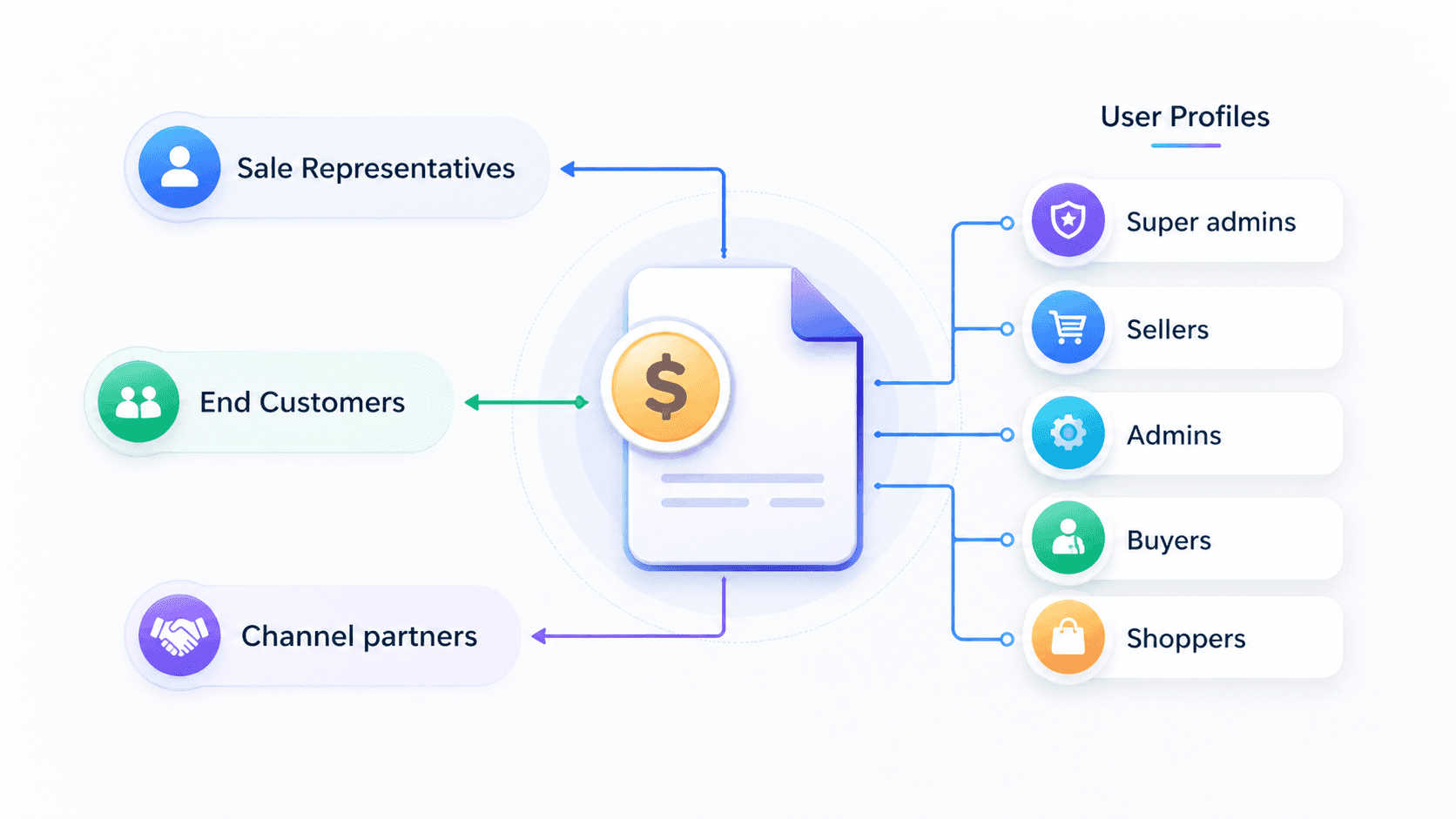
Quotes are used by a diverse set of stakeholders — including sales representatives, end customers, and channel partners — each operating under different roles such as admins, buyers, and sellers, with distinct needs and permissions across the workflow.
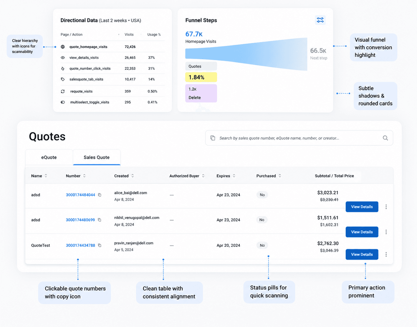
Users primarily engaged with quote details and navigation entry points, indicating a strong need to understand quote status and access actionable information quickly.
View Details
Quotes number
Sales Quotes tab
The top engagement of the functions
Limited search capability
Users can only search by full quote number, making it difficult to quickly find relevant quotes
Low visibility in navigation
The distinction between eQuotes and Sales Quotes is not clearly surfaced, causing confusion
Insufficient item-level information
Key details such as product lifecycle (e.g. EOL) are missing from the overview
Lack of clear quote status and context
Users cannot easily understand shipping status, pending actions, or cancellation states
Customer Feedback on Quote to Order Process
Data shows how customers engage on each steps
One signal was very clear:
Around 30% of customers dropped off from Quotes Home to Checkout.
Quote-to-Checkout Workflow
I interviewed 6 mid size enterprise customers who have been making the purchasing decision with their team. So I asked the users to look at current quotes homepage, to tell us how they would use the homepage to evaluate if the page is the right starting point for them to complete their purchase.
Insights:
Customer struggle to identify the things like quote type, status, and managing their quotes efficiently in quotes homepage.
Customers were not thinking about quotes as documents. They were thinking about progress.
Customers wanted to know where they were in the buying process, what had already been completed, and what they needed to do next.
Customer Feedback & Complaints
Brainstorming through workshop with stakeholders
Base on the discussion, we reframed the problems:
Unclear quote types
Limited visibility
Lack of status clarify
Inefficient workflow
Unified quote types
Combined Sales Quotes and eQuotes into a single, streamlined view to reduce confusion
Improved findability
Introduced filtering (e.g. creator, status, price range) to help users quickly locate relevant quotes
Enhanced workflow efficiency
Reduced reliance on navigation between pages by surfacing key information and actions directly on the homepage
Combined Sales Quotes and eQuotes into a single, streamlined view to reduce confusion
Introduced filtering (e.g. creator, status, price range) to help users quickly locate relevant quotes
Enhanced workflow efficiency
Reduced reliance on navigation between pages by surfacing key information and actions directly on the homepage
With all these data and customer feedback and insights, I facilitated a sec workshop with business stakeholders and product managers to synthesis these inputs into problem statement.
The goal was to identify which pain points were most repeated and most important to solve.
Based on the problem statements, we finally narrowed our design goals:
From the data:
30% customers exit during the edit quotes process.
More customers are looking for offline sales reps when logging in quotes homepage.
Improved Self-Serve Quote Completion
Improved Self-Serve Quote Completion
Fragmented flow across multiple pages (homepage → review → edit → checkout)
Frequent back-and-forth navigation between steps
Key actions (edit, checkout) buried behind multiple interactions
To simplify this, I focused on the CTA strategy on Quotes Home. The team explored a few different options: the first option is still keeping “View Details” as the primary action,and 2nd option is making “Buy Now” the primary CTA for actionable quotes and third option is using “View & Buy” to make the purchase intent more explicit,
Streamlined flow with direct access to key actions from the homepage
Reduced navigation by enabling Edit and Buy Now in-context
Faster path to checkout with fewer steps and clearer progression
After the whole redesign launch, we saw the quote flow drop-off rate decrease from 30% to 22%, an 8 percentage-point reduction.
We also saw customer complaints decrease by 30% relative to the pre-redesign baseline.
In this project, we did have some quantitative data, like funnel drop-off and CSAT trends, but the data was still limited coz it is an b2b project. So the design direction could not come from one metric or one stakeholder’s opinion. I had to combine the available data with customer feedback, interviews, and stakeholder workshops to build a more reliable understanding of the problem.
The second lesson was about workflow-driven design. In B2B experiences, users are usually trying to complete a job efficiently and confidently. So the design needs to clarify status, reduce friction, guide the next action, and help users finish the workflow with fewer interruptions.
After the whole redesign launch, we saw the quote flow drop-off rate decrease from 30% to 22%, an 8 percentage-point reduction.
We also saw customer complaints decrease by 30% relative to the pre-redesign baseline.
In this project, we did have some quantitative data, like funnel drop-off and CSAT trends, but the data was still limited coz it is an b2b project. So the design direction could not come from one metric or one stakeholder’s opinion. I had to combine the available data with customer feedback, interviews, and stakeholder workshops to build a more reliable understanding of the problem.
The second lesson was about workflow-driven design. In B2B experiences, users are usually trying to complete a job efficiently and confidently. So the design needs to clarify status, reduce friction, guide the next action, and help users finish the workflow with fewer interruptions.
Thank you for scrolling:)
If you want to see more detail about this project, feel free to reach out!