Thank you for scrolling:)
If you want to see more detail about this project, feel free to reach out!
Data visualization
• Table
Data visualization
• Chart
Fintech
CLIENT:
HSBC
YEAR:
2024-2025
MY ROLE
Senior UX Designer

HSBC- AI Forecast Interest Rate
Business & System Challenges

Full Story
Fintech
CLIENT:
HSBC
YEAR:
2024-2025
MY ROLE
Senior UX Designer
HSBC- AI Forecast Interest Rate
My Role


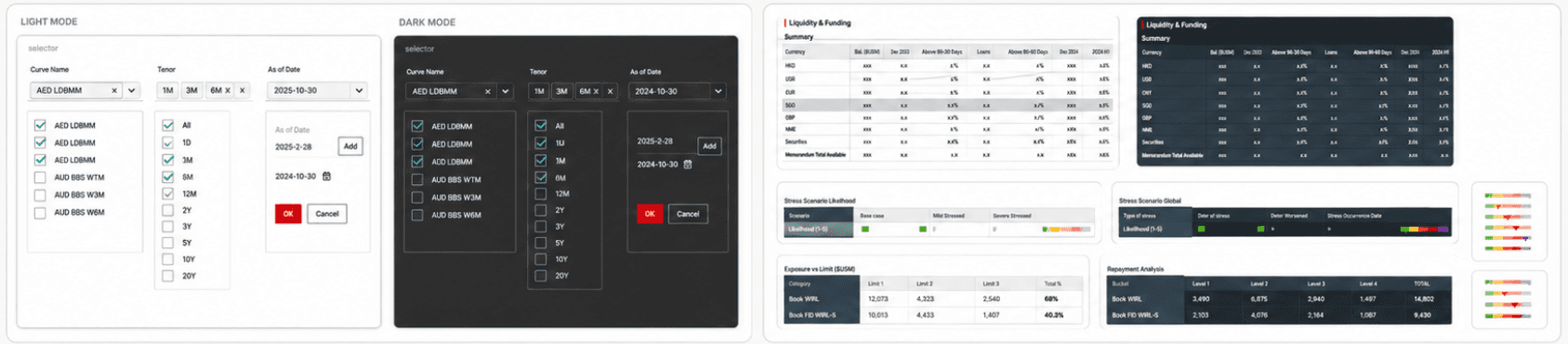
Following financial analysts’ mental models, I mapped Duration to the X-axis and Interest Rates to the Y-axis, ensuring the visualization felt familiar and actionable.
Data visualization • Chart
Following financial analysts’ mental models, I mapped Duration to the X-axis and Interest Rates to the Y-axis, ensuring the visualization felt familiar and actionable.
Data visualization • Chart

There were several challenges.
First, the existing solution relied on a third-party legacy system, which cost millions of dollars every year. At the same time, it raised data security concerns, since sensitive interest rate data had to go through that external system. Second, the overall forecasting workflow was quite inefficient. It often took a long time for financial analysts to go through the process and get a final result.
📌 After AI: A Human-in-the-Loop Forecasting Workflow
In the AI-powered workflow, analysts begin by uploading historical data directly into the forecasting system. The AI model then generates initial interest rate curves, allowing users to quickly view, compare, and explore different scenarios at scale.
From raw AI outputs to explainable decision controls
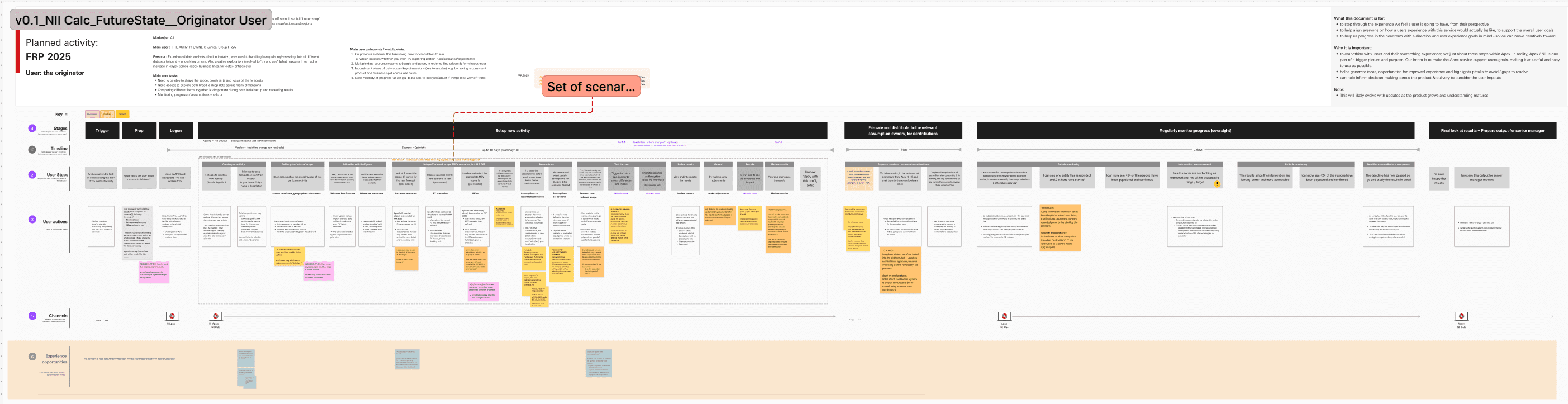
The AI model initially surfaced its predictions as raw numerical outputs — precise, yet disconnected from how financial analysts think and work. Working closely with the data science team, I unpacked the model’s logic and conducted user audits to understand the real decision-making workflow behind interest rate forecasting.
Financial Analyst
Responsible for monitoring and forecasting interest rates across multiple countries on a daily basis. Need to view and compare results without relying on complex Excel models.
Senior Financial Analyst
Responsible for ensuring the accuracy, consistency, and governance of interest rate forecasts across the organization. Need to review, calibrate, or override outputs when discrepancies arise.
Data visualization
Quickly understand AI-predicted interest rates in a structured, form-based view.
Analyze interest rate trends and patterns through charts view.
Compare multiple interest rate scenarios side by side.
Review, Calibrate & Replace
Review and calibrate AI-generated interest rate predictions before finalizing decisions
Replace AI outputs with analyst-approved calibrations once they are validated
Through research with analysts, I identified a recurring workflow: comparing data curves by holding specific dimensions (Tenor/Duration) constant while rapidly pivoting others. To align with this mental model, I focused on optimizing multi-parameter filtering efficiency.
To support Calibration, I introduced an “Enable shocks” toggle that allows advanced users to calibrate and fine-tune AI-generated curves by adjusting scenarios and methods.
Advanced users needed deep control over multiple curves without the "navigation fatigue" of jumping between separate detail pages.
Expected Workflow
Bridging AI Logic and Human Decision-Making
User Persona & User flow
Discovery Workshop with business stakeholders
Design Goals
Data visualization • Compare
Review, Calibrate & Replace
User Flow for Common Users
User Flow for Advanced Users
Impact

“I’m thrilled to recommend Alice Bai, an outstanding UX designer whose user-centric approach and collaboration skills left a lasting impact on our team at Apex product delivery. As her line manager, I had the privilege of working closely with Alice and can confidently share for her expertise.
Alice has a rare talent for translating complex business requirement into intuitive, visually UX and UI designe solutions. Her mastery of user interview, wireframing, and interactive prototyping was instrumental in our strategic product delivery.
Beyond technical skills, Alice is an empathetic team player, she thrives in cross-functional environments, bridging gaps between design, engineering, and stakeholders with clarity and quality.”


What people say about me

I translated these complex backend outputs into an intuitive, multi-dimensional table view. My goal was to create a "zero-learning-curve" interface for interest rate comparison.
Data visualization • Compare
Through research with analysts, I identified a recurring workflow: comparing data curves by holding specific dimensions (Tenor/Duration) constant while rapidly pivoting others. To align with this mental model, I focused on optimizing multi-parameter filtering efficiency.
Design Exploration Review, Calibrate & Replace
To support Calibration, I introduced an “Enable shocks” toggle that allows advanced users to calibrate and fine-tune AI-generated curves by adjusting scenarios and methods.
General User Flow for Advanced Users
General User Flow for Common Users
Impact

“I’m thrilled to recommend Alice Bai, an outstanding UX designer whose user-centric approach and collaboration skills left a lasting impact on our team at Apex product delivery. As her line manager, I had the privilege of working closely with Alice and can confidently share for her expertise.
Alice has a rare talent for translating complex business requirement into intuitive, visually UX and UI designe solutions. Her mastery of user interview, wireframing, and interactive prototyping was instrumental in our strategic product delivery.
Beyond technical skills, Alice is an empathetic team player, she thrives in cross-functional environments, bridging gaps between design, engineering, and stakeholders with clarity and quality.
Thank you for scrolling:)
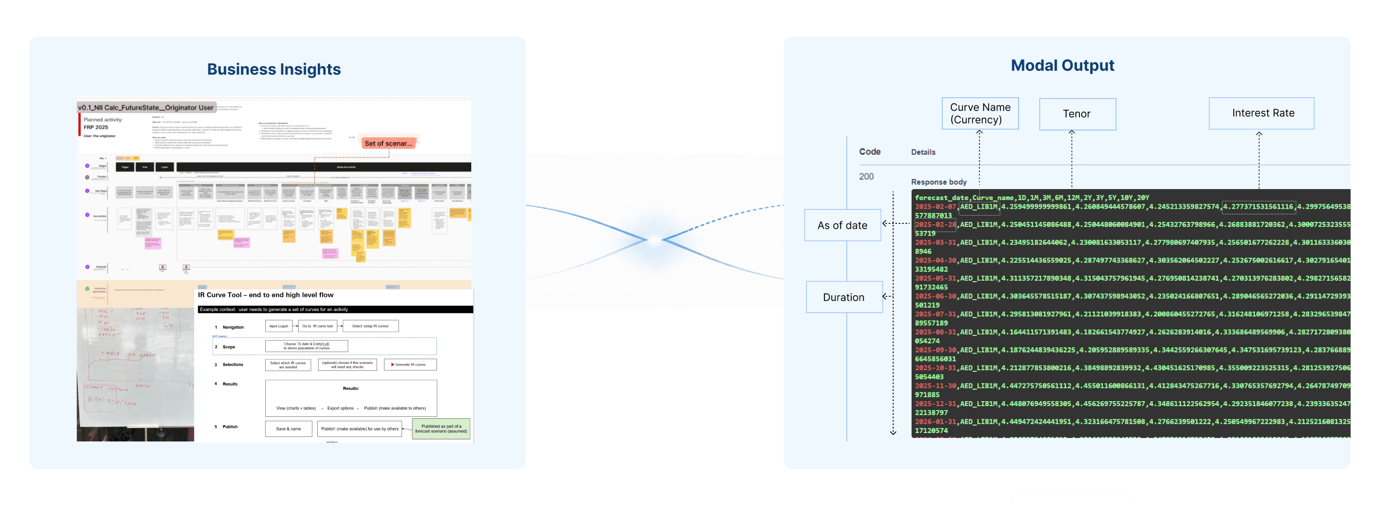
I started by gathering business insights, I facilitated a series of workshops with stakeholders using FigJam so that i can create journey map based on their expectation.
Context
The goal of this product was to help analysts forecast future interest rate trends more efficiently and make better decisions under uncertainty.
Challenge:
First, the existing Interest rate forecasting process relied on a third-party legacy system, which cost millions of dollars every year.
Second, the overall forecasting workflow was quite inefficient. It often took a long time for financial analysts to go through the process and get a final result.
Impact:
70% faster forecasting via automated AI workflows.
50+ data sources synthesized into a unified interaction model.
90% adoption rate among institutional analysts by designing for AI explainability.
My Role: Solo designer
UX design
Documentation
Design system
Team: Design team
Business team
Data Science team
Engineering team
Product Manager
About this Project
Design Exploration
Data visualization • Table
I translated these complex backend outputs into an intuitive, multi-dimensional table view. My goal was to create a "zero-learning-curve" interface for interest rate comparison.
Context
The goal of this product was to help analysts forecast future interest rate trends more efficiently and make better decisions under uncertainty.
Challenge:
First, the existing Interest rate forecasting process relied on a third-party legacy system, which cost millions of dollars every year.
Second, the overall forecasting workflow was quite inefficient. It often took a long time for financial analysts to go through the process and get a final result.
Impact:
70% faster forecasting via automated AI workflows.
50+ data sources synthesized into a unified interaction model.
90% adoption rate among institutional analysts by designing for AI explainability.
Full Story
There were several challenges.
First, the existing solution relied on a third-party legacy system, which cost millions of dollars every year. At the same time, it raised data security concerns, since sensitive interest rate data had to go through that external system. Second, the overall forecasting workflow was quite inefficient. It often took a long time for financial analysts to go through the process and get a final result.
Business & System Challenges
📌 After AI: A Human-in-the-Loop Forecasting Workflow
In the AI-powered workflow, analysts begin by uploading historical data directly into the forecasting system. The AI model then generates initial interest rate curves, allowing users to quickly view, compare, and explore different scenarios at scale.
Expected Workflow
From raw AI outputs to explainable decision controls
The AI model initially surfaced its predictions as raw numerical outputs — precise, yet disconnected from how financial analysts think and work. Working closely with the data science team, I unpacked the model’s logic and conducted user audits to understand the real decision-making workflow behind interest rate forecasting.
Bridging AI Logic and Human Decision-Making
Bridging AI Logic and Human Decision-Making
Discovery Workshop with business stakeholders
I started by gathering business insights, I facilitated a series of workshops with stakeholders using FigJam so that i can create journey map based on their expectation.
Financial Analyst
Responsible for monitoring and forecasting interest rates across multiple countries on a daily basis. Need to view and compare results without relying on complex Excel models.
Senior Financial Analyst
Responsible for ensuring the accuracy, consistency, and governance of interest rate forecasts across the organization. Need to review, calibrate, or override outputs when discrepancies arise.
User Persona & User flow
User Persona & User flow
Following financial analysts’ mental models, I mapped Duration to the X-axis and Interest Rates to the Y-axis, ensuring the visualization felt familiar and actionable.
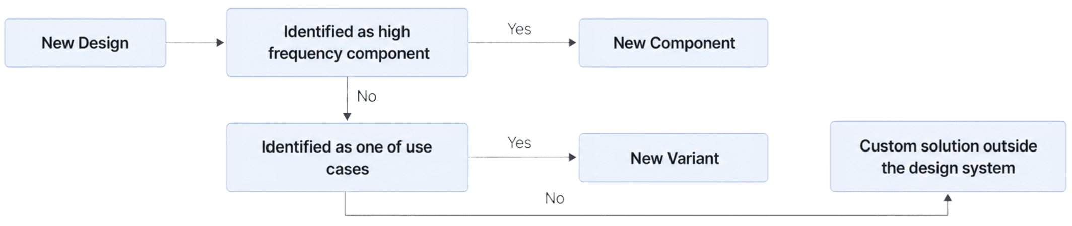
I used a simple decision process to maintain the design system.
If a pattern would be reused across workflows, it should become a component. If it was just a different state or behavior of something we already had, it should become a variant. But if it was truly business-specific and not reusable, I kept it outside the design system intentionally.
And I think that last part is important. Not everything should become part of the design system. Otherwise, the system becomes too heavy and hard to maintain. So the goal was to keep the system useful, consistent, and clean, while still supporting real product needs.
By the end of my involvement, the project had moved beyond concept. The design direction was approved by the business lead, and the technical feasibility had been validated with engineering.
The product then moved into implementation, with the goal of replacing the legacy third-party forecasting system over time.
Design System